Introduction
I was curious to model the effectivness of Messi scoring goals in La Liga. He has been Pichichi for the last 3 years, so I guess he is quite effective in scoring goals in the opportunities he has. To model the goals scored by Messi in different seasons, I will use the following bayesian models:
- Simple model
- Hierarchical model
- State space model
Simple Model
I am going model the number of goals scored against the attempts during each season. Each parameter of the model, for each season, is going to be modeled independently.
The models is very simple:
\[\textrm{Likelihood: } \quad score_i \sim binomial(N_i, p_i)\] \[\textrm{Prior: } \quad p_i \sim beta(\alpha, \beta)\]
where,
- \(score_i\) number of goals scored in season i
- \(N_i\) number of attempts in season i
- \(p_i\) proportion of goals scored against the total attempts in season i
- \(\alpha\) and \(\beta\) parameters of the beta distribution that I need to figure out
Now, I need to figure out those \(\alpha\) and \(\beta\) parameters that model the proportion of goals. What I normally do it is to use the prior predictive simulation, i.e, I simulate prediction from a model, using only the prior distribution instead of the posterior distribution.
As I said, Messi has to be very good in scoring goals, so I tried different \(\alpha\) and \(\beta\) and check the distribution of the proportion. I wanted to get a distribution where the extreme values were rare, i.e, no proportion above 0.7 or below 0.2, and the mean of the distribution was around 0.3 - 0.4.
At the end, I came up with \(\alpha = 50\) and \(\beta = 100\), and the distribution look like this:
library(ggplot2)
library(rstan)
library(rvest)
library(tidyverse)
library(rethinking)

sim = 1e4
prior_p <- rbeta(n = sim, shape1 = 50, shape2 = 100) %>% as.data.frame %>% magrittr::set_colnames(c("proportion"))
g <- ggplot(prior_p, aes(proportion)) +
      theme_light() +
      geom_histogram(bins = 30) +
      labs(title = 'Goals Proportion', x = 'proportion', y = 'counts')
g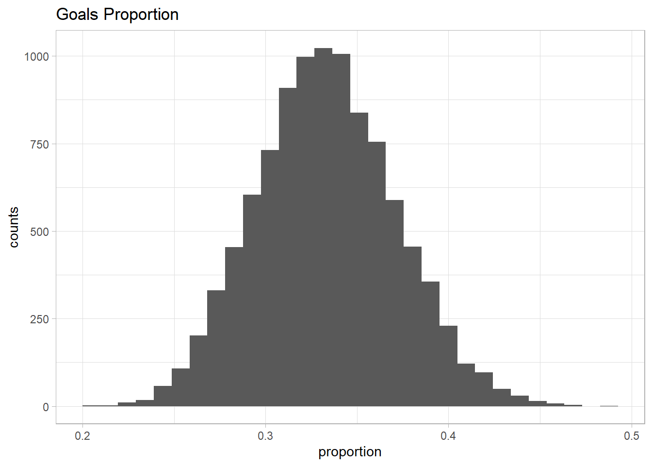
cat("Mean of the distribution: ", mean(prior_p$proportion), "\n")
cat("Median of the distribution: ", median(prior_p$proportion), "\n")
cat("95% of the distribution: ", quantile(prior_p$proportion, c(0.025, 0.975)), "\n")
cat("Percentage of the values above 70%: ", sum(prior_p$proportion > 0.7) /sim * 100, "%", "\n")
cat("Percentage of the values below 20%: ", sum(prior_p$proportion < 0.2) /sim * 100, "%")
## Mean of the distribution: 0.3331552
## Median of the distribution: 0.3324136
## 95% of the distribution: 0.2612867 0.4097215
## Percentage of the values above 70%: 0 %
## Percentage of the values below 20%: 0 %So based on my belief, those parameters used in the Beta distribution capture what I was expecting about the proportion of goals that Messi could achieve per season.
Now it is time to simulate the goals scored with this information. I will run 10,000 simulation and I need in addition how many attempts Messi has per season. I don’t have a clue, but let’s be a consultant and guess. In a season there are 38 matches. Of those 38 matches, I guess Messi can have around 3 attempts per match (guessing he scores 1 out of 3 attempts, so one goal per match). This gives us a total of 114 attempts per season. Now the prior predictive simulation:
attempts <- 38*3
prior_p <- rbeta(n = sim, shape1 = 50, shape2 = 100)
prior_predictive <- rbinom(n = sim, size = attempts, prob = prior_p)

prior_predictive <- prior_predictive %>% as.data.frame %>% magrittr::set_colnames(c("goals_scored"))

g <- ggplot(prior_predictive, aes(goals_scored)) +
      theme_light() +
      geom_histogram(bins = 30) +
      labs(title = 'Goals Scored', x = 'n° of goals', y = 'counts')
g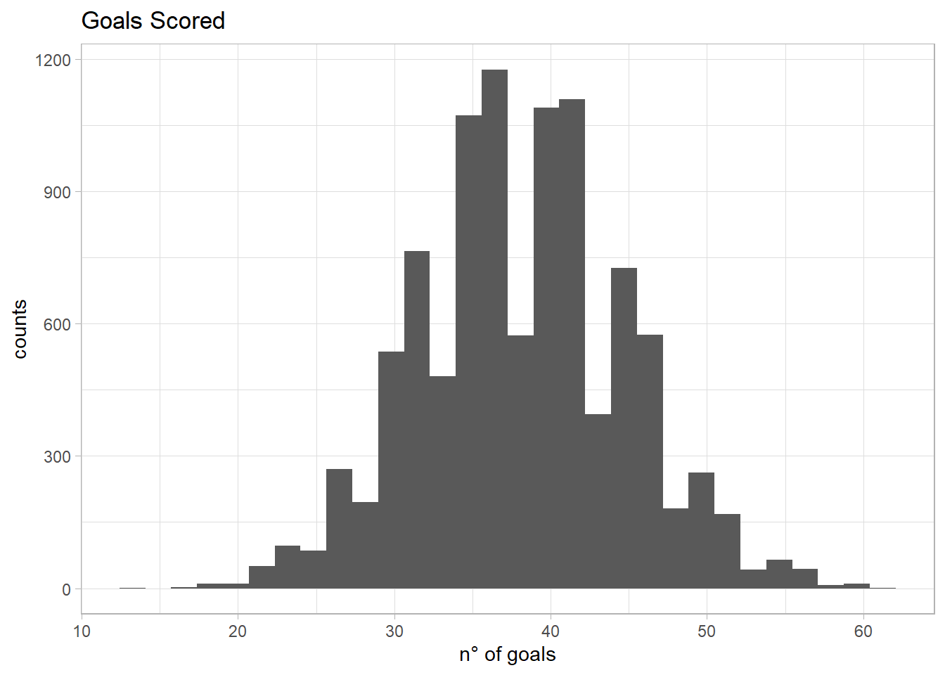
mean(prior_predictive$goals_scored)
quantile(prior_predictive$goals_scored, c(0.025, 0.975))
## [1] 38.0736
## 2.5% 97.5%
## 25 51It seems reasonable to me so I am going to use the above information to perform the analysis using Stan. Now we need data, I just got the data from yahoo sports where I could find the goals and attempts per season:
html <- read_html("https://sports.yahoo.com/soccer/players/372884/")
tables <- html_nodes(html, "table")
messi <- html_table(tables[2])
messi_df <- as.data.frame(messi[[1]])
names(messi_df) <- messi_df[1,]
messi_df <- messi_df[-1,]

messi_laliga <- messi_df %>%  filter(League == "La Liga") %>%
  select(Season, G, SHO) %>%
  filter(Season != "2019/2020")

messi_laliga$G <- as.integer(messi_laliga$G)
messi_laliga$SHO <- as.integer(messi_laliga$SHO)
messi_laliga <- rbind(messi_laliga, c("Total", sum(messi_laliga$G), sum(messi_laliga$SHO)))

messi_laliga
## Season G SHO
## 1 2013/2014 28 111
## 2 2014/2015 43 147
## 3 2015/2016 26 117
## 4 2016/2017 37 131
## 5 2017/2018 34 153
## 6 2018/2019 36 141
## 7 Total 204 800Once we have the data, it is time to build the model in a file to use it in Stan:
cat("data {
  int<lower=0> N;
  int successes[N];
  int attempts[N];
}

parameters {
  real<lower=0, upper=1> p[N];
}

model {
  // prior
  for(i in 1:N){
    p[i] ~ beta(50, 100);
  }

  // likelihood
  for(i in 1:N){
    successes[i] ~ binomial(attempts[i], p[i]);

  }

}
", file = "messi_model_1.stan")
Now that we have the Stan model saved as messi_model_1.stan, we prepare the data to run the program:
data <- list(attempts = as.integer(messi_laliga$SHO),
             successes = as.integer(messi_laliga$G),
             N = nrow(messi_laliga))
I am going to run the model with 3 chains, 6000 iterations for each chain:
messi_model_1 <- stan_model("messi_model_1.stan")
messi_model_1_fit <- sampling(object = messi_model_1, data=data, chains=3,
                                        iter=6000, thin=1)
tracerplot(messi_model_1_fit)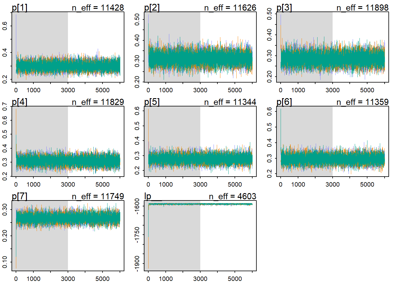
Now let’s check the results of the fit using some functions from the rethinking package. First, I check the traceplot. The traceplot plots the samples (of the parameters) in sequencial order, joined by a line. There are 3 things to look at:
- Stationarity: means that the chain stays within the same high probability portion of the posterior distribution. These traces all stick around a very stable central tendency, the center of gravity of each dimension (parameter) of the posterior. For example, for the p[1], it seems that the traces ocillate around a value of 0.3 very stable.
- Good mixing: means that the chain rapidly explores the full region of the posterior, rapidly zig-zags around.
- Convergence: means that multiple, independent chains stick around the same region of high probability.
It seems that our chains reached stationarity, had a good mixing and had converged. But it can be a little difficult to extract information from the traceplot. Many chains putting together, may let us believe that everything is fine, but maybe something is hided in the bush.
In the reference book [1] below, the author mention a second way to visualize the chains using the trank plot: “What this means is to take all the samples for each individual parameter and rank them. The lowest sample gets rank 1. The largest gets the maximum rank (the number of samples across all chains). Then we draw a histogram of these ranks for each individual chain. Why do this? Because if the chains are exploring the same space efficiently, the histograms should be similar to one another and relatively uniform”
trankplot(messi_model_1_fit)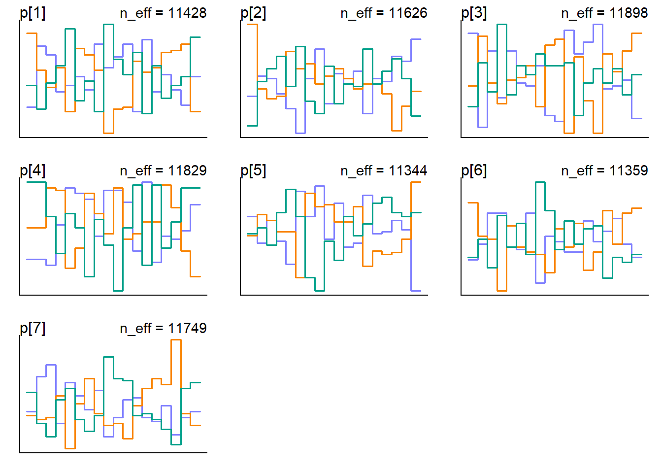
In the horizontal axis is the rank, from 1 to the number of samples across all chains (in our case 9000 = ((6000 - 3000 (warmup)) x 3 ). The vertical axis is the frequency of ranks in each bin of the histogram. What we look for is histograms that overlap and stay within the same range as it shows in the plot above. There are some bins greater than others but not absurdly different. I’am ok how it looks.
messi_model_1_summary <- summary(messi_model_1_fit, probs = c(0.025, 0.975))
messi_model_1_summary_df <- as.data.frame(messi_model_1_summary$summary)
messi_model_1_summary$summary
## mean se_mean sd 2.5% 97.5%
## p[1] 0.2988511 0.0002666460 0.02850466 0.2449612 0.3560985
## p[2] 0.3128436 0.0002497489 0.02692889 0.2616850 0.3662710
## p[3] 0.2848324 0.0002532315 0.02762240 0.2318001 0.3402991
## p[4] 0.3089807 0.0002551867 0.02775398 0.2560241 0.3640804
## p[5] 0.2768798 0.0002443604 0.02602587 0.2268632 0.3290213
## p[6] 0.2954544 0.0002488400 0.02652066 0.2443126 0.3488094
## p[7] 0.2675295 0.0001328790 0.01440312 0.2398841 0.2972685
## lp__ -1587.7901178 0.0279766738 1.89800124 -1592.3637927 -1585.1170115
## n_eff Rhat
## p[1] 11427.777 1.0000541
## p[2] 11625.979 1.0003074
## p[3] 11898.369 0.9998684
## p[4] 11828.631 0.9997700
## p[5] 11343.549 1.0000082
## p[6] 11358.696 0.9997254
## p[7] 11748.995 0.9999425
## lp__ 4602.574 1.0004312messi_model_1_subset <- messi_model_1_summary_df[-nrow(messi_model_1_summary_df),]
ggplot(messi_model_1_subset, aes(x=messi_laliga$Season, y = messi_model_1_subset$mean)) +
geom_point() +
geom_errorbar(aes(ymin=messi_model_1_subset$`2.5%`, ymax=messi_model_1_subset$`97.5%`), width=.1) +
theme_light() +
ylim(0.15, 0.45) +
labs(title = "Proportion Posterior Mean including 95% Percentile Interval", x = "season", y="posterior mean")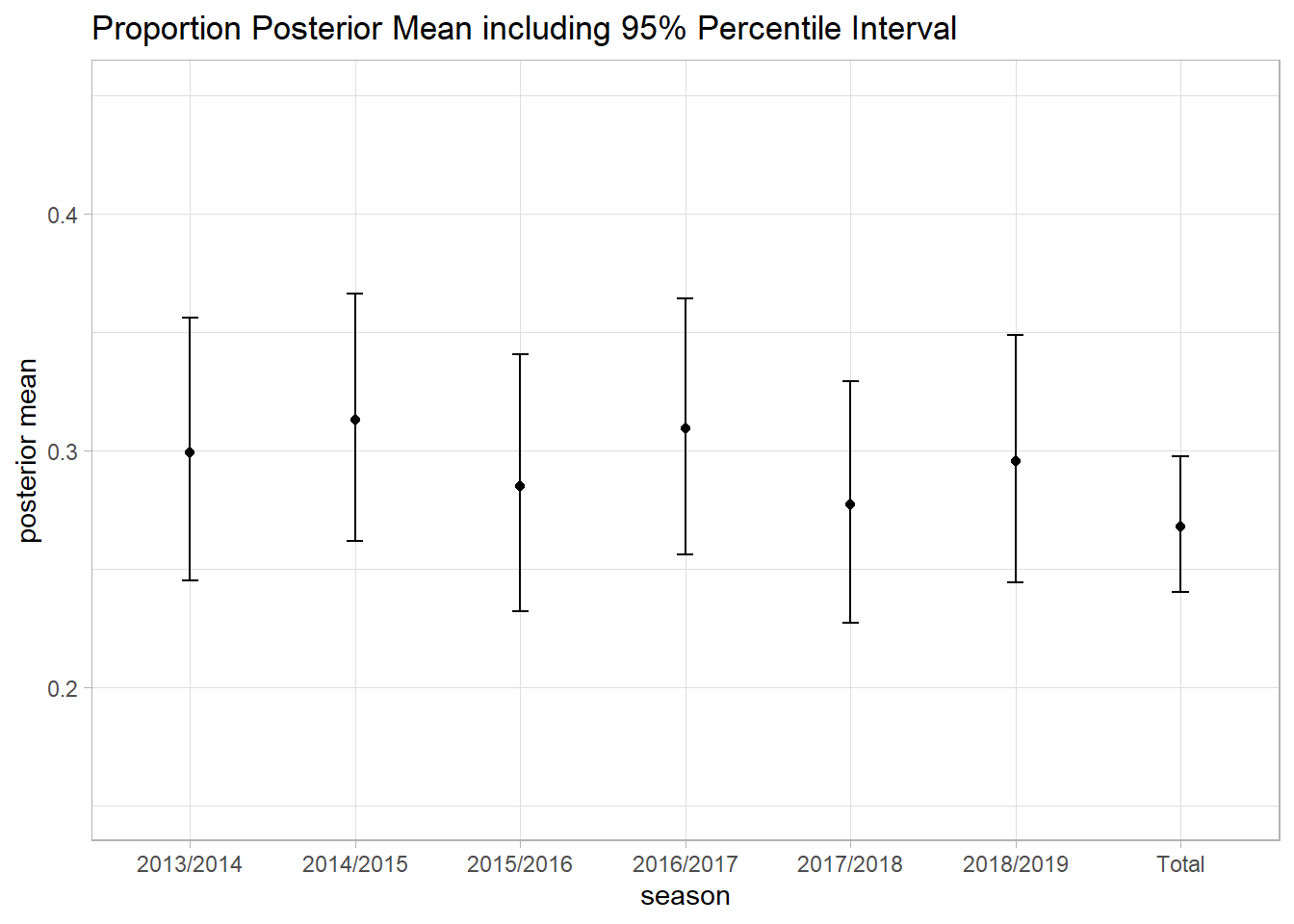
Also I look at the effective sample size and the Rhat:
- Effective sample size: is an estimate of the number of independent samples from the posterior distribution. Markov chains are typically autocorralated, so that sequential samples are not entirely independent [1]. So if your goal is to get a posterior mean, you shouldn’t need many samples to have a good estimate. But if you are interested also in the percentiles in the extreme tails of the posterior, then you should need more.
- Rhat: this is the Gelman-Rubin convergence diagnostic. When Rhat is above 1.00, it usually indicates that the chain has not yet converged.
What is more samples needed? Who knows. I just check the effective sample size and if there is a huge gap (much less effective samples than the actual number of iterations) then I will run more iterations and check again all the plots above and also the effective sample size and Rhat. Trial and error baby!. Coupled with this, I also check the autocorrelation plots to assess the correlation at different lags. Using shinystan package is very convinient, because most of the plots showed above and more, can be obtained from this package. Try it!
About the Rhat, I take it in consideration together with the visual analysis we did above. Kind of confirmatory analysis.
So what we have, the sample size is above our actual number of iterations (minus warmup) of the chains. We have 6,000 iterations minus 3,000 warmup (default stan takes 50% as a warmup) give us 3,000 samples per chains, with 3 chains, we have 9,000 total samples. All the effective sample sizes are above 13,000. How can we have more effective sample size than samples? I looked at the Stan reference manual: “Effective sample size (n_eff) can be larger than the sample size (N) in case of antithetic Markov chains, which have negative autocorrelations on odd lags. The no-U-turn sampling (NUTS) algorithm used in Stan can produce n_eff > N for parameters which have close to Gaussian posterior and little dependency on other parameters”. So we are good here.
Rhat is basically 1.00, which suggests that the chain could have converged.
There is one more thing I do and this is the posterior predictive check. This helps me to check if the model built, it is actually producing data as the one we used to train it. I will do this and bye:
p <- rstan::extract(messi_model_1_fit, pars="p[1]")
p <- p$`p[1]`

post_pred_check <- rbinom(n = 1e4, size = as.integer(messi_laliga$SHO[1]), prob = p)

cat("Mean   --->", mean(post_pred_check), "predicted vs.", messi_laliga$G[1],"actual", '\n')
cat("Median --->", median(post_pred_check), "predicted vs.", messi_laliga$G[1],"actual", '\n')
cat("Percentile Interval: ", quantile(x = post_pred_check, probs = c(0.05, 0.95)), '\n')
cat((sum(post_pred_check < 30) - sum(post_pred_check < 26))/1e4 * 100, "%")

hist(post_pred_check, main="Posterior Predictive Check", xlab = "Goals")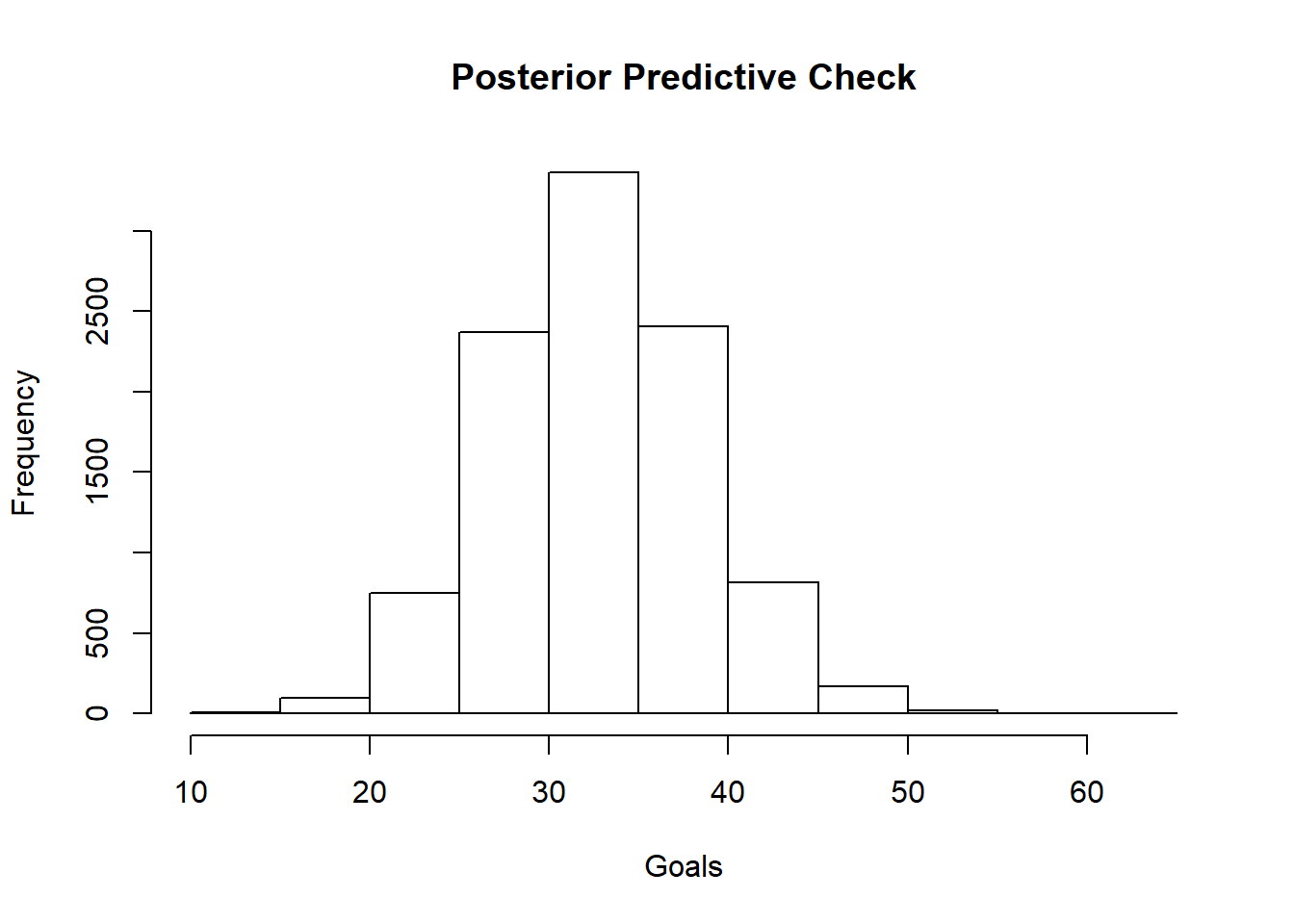
## Mean   ---> 33.2155 predicted vs. 28 actual
## Median ---> 33 predicted vs. 28 actual
## Percentile Interval:  24 43
## 17.76 %
Above I simulated the posterior predictive distribution for the season 1. The median of the distribution was 33 goals and the actual goals scored by Messi that season was 28. A difference of 5 goals. I was expecting something closer to the actual goals. I am dissapointed. Let’s see later if the other models could do a better job in predicting the goals.
[1] Statistical Rethinking - A Bayesian Course with Examples in R and Stan, 2e, Richard McElreath
If you want to learn more about bayesian data analysis, you can do the following (my favorite secret resources :P ):
- Start with:
- Then:
- https://github.com/rmcelreath/statrethinking_winter2019
- https://www.youtube.com/watch?v=EbJSMg1NiGo&list=PL_lWxa4iVNt1ANb0x2ZzEz0YNnSuPExqs (there is a Fall 2019 but not yet completed)